The company
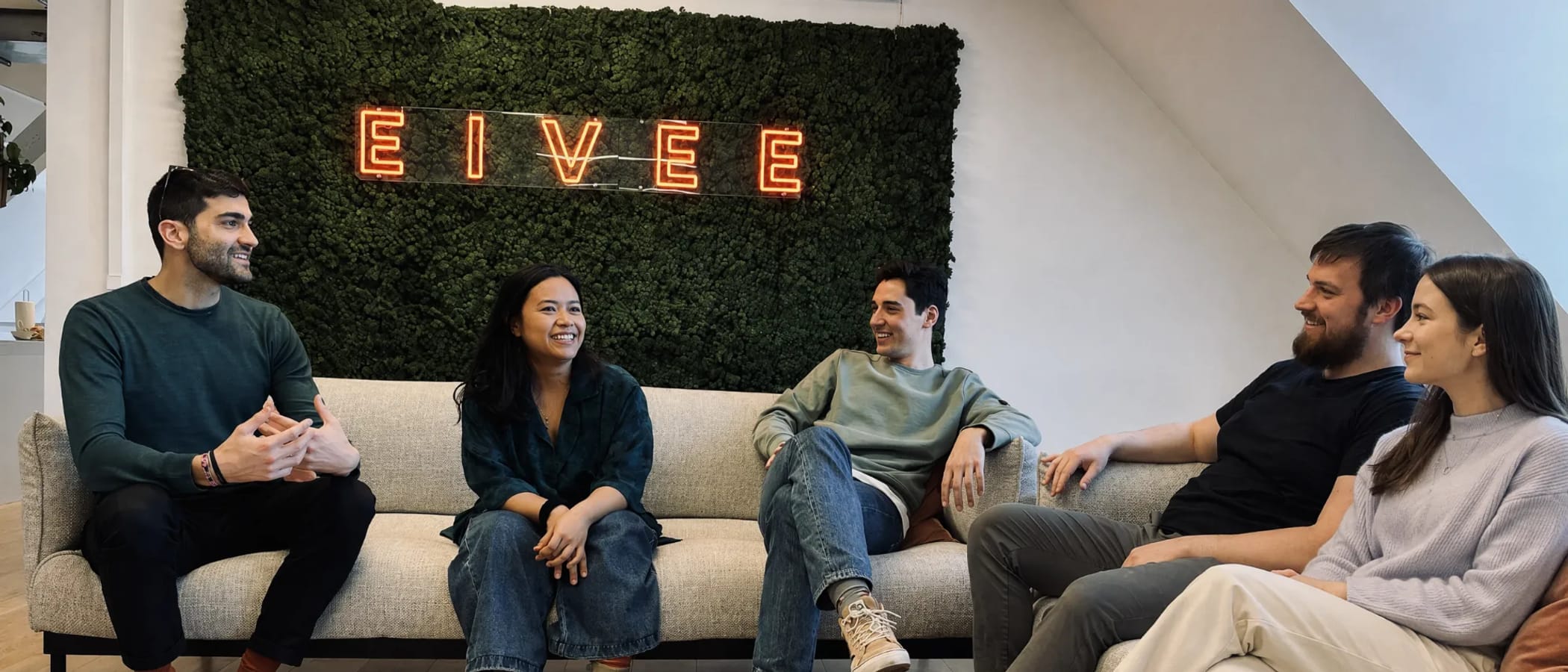
EIVEE is a Copenhagen company founded in 2020 by procurement experts. Its platform brings procurement and sustainability together, giving companies validated visibility of their external spend and the emissions behind it, so they can report on them and act on them. In 2022, EIVEE raised a €4 million seed round led by Seed Capital Denmark to grow its platform across Scandinavia.
- Founded2020
- WhereCopenhagen, Denmark
- ProductSaaS platform
The mission
EIVEE’s vision, in its own words, is “a sustainable world made possible and profitable”; its mission, net zero through supply chain transparency. In the autumn of 2022 it was preparing to launch its first product of its own, with an MVP due in December, and the product team needed a shared, research-based picture of who that product was for. The question behind my work:
Who uses EIVEE, and how can its first product turn procurement data into decisions they trust?
And with it: how can a shared picture of EIVEE's users guide the design of its first product?
The product
Until then, EIVEE’s product was a set of dashboards: it collected each customer’s procurement data, processed and enriched it, and published the dashboards into the customer’s own Power BI, with no IT integration on their side.
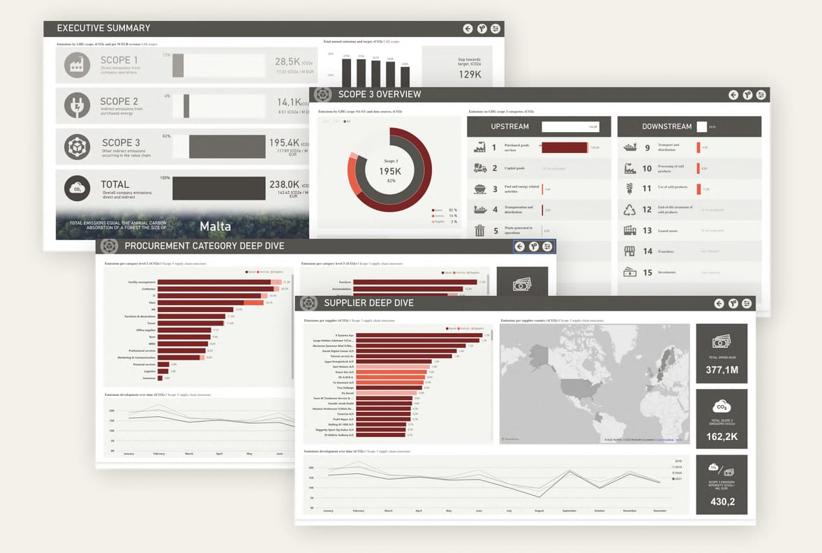
The new product rebuilt the four modules that lived in Power BI as a web product of EIVEE’s own: Spend Visibility, Performance Management, Analytics & Advisory and Sustainable Procurement. Each module carries many data points, each needing the right chart to say what it means. The MVP started with the sustainability module, from an executive summary down to the emissions per supplier, procurement category and business unit.
My role
I joined EIVEE in September 2022 as a UX designer, working closely with Line, a fellow UX designer, and Julia, our UI designer, alongside Lasse, our product manager. The MVP was the core of our work: the three of us designed it together, from the first audits to the prototypes the developers built from. It started with understanding who our users were, and I was in charge of the whole UX research at EIVEE: desk and competitor research, surveys, the facilitation workshops, and the first personas.
The proto-persona workshop
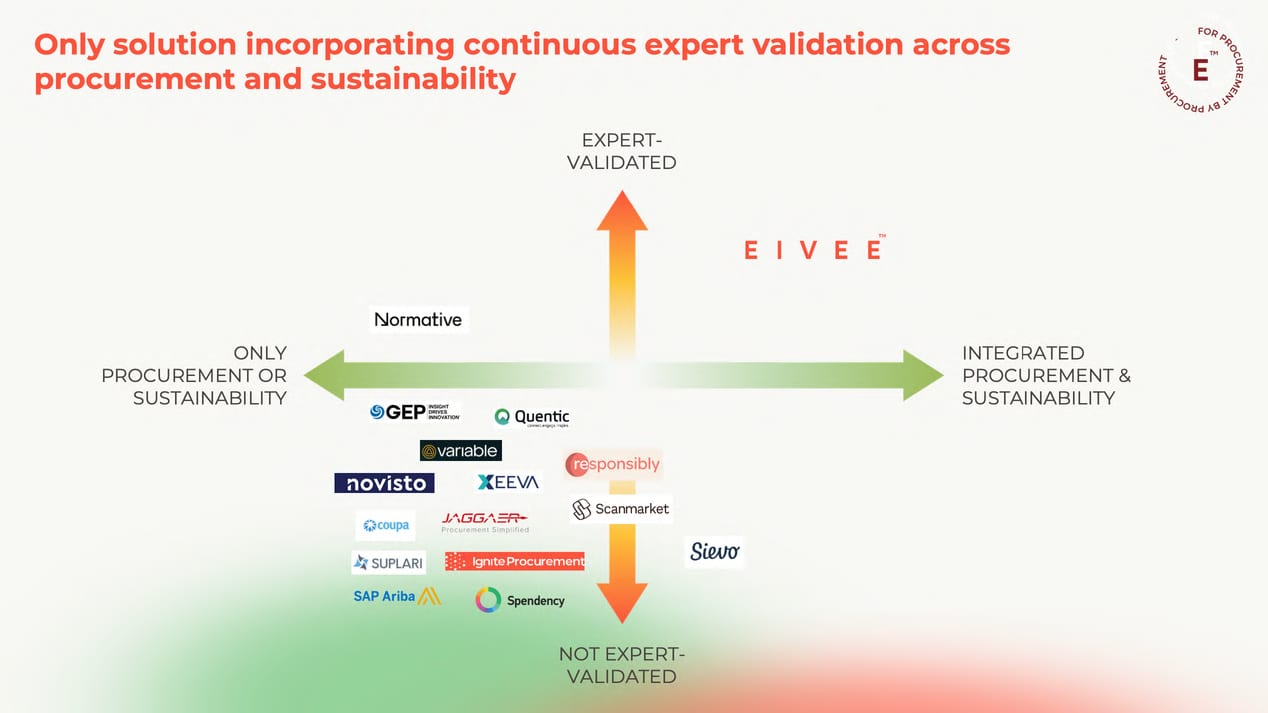
The groundwork. I started with the procurement world itself, academic papers and industry reports, then a competitor analysis of design, websites and tone of voice, positioning EIVEE against Normative, Responsibly and Sievo. I then designed a survey for end users. Beside questions on the modules, it borrowed the idea behind UX cards: positive experiences with technology come from the psychological needs a product fulfils, such as security, autonomy, competence, influence, pleasure, meaning or belonging. Asking which of these needs their favourite work tools fulfil was a way to learn what EIVEE’s product had to make its users feel, not only what it had to show them.
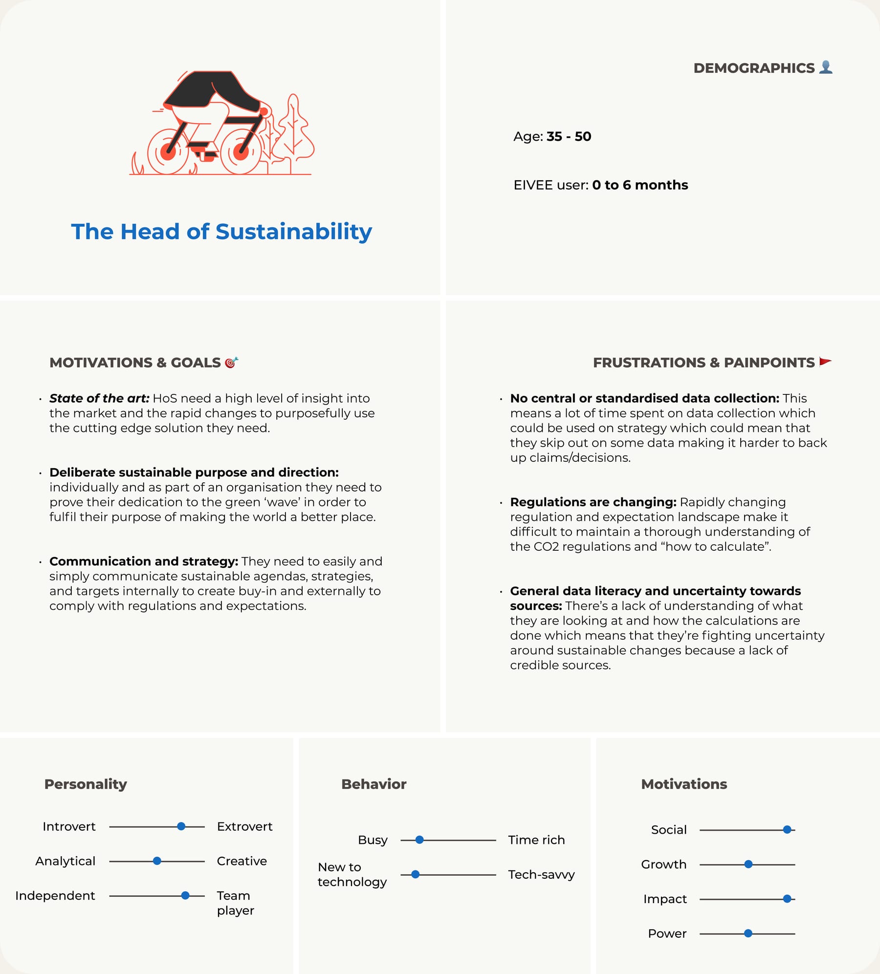
The turning point. End users were hard to reach before the launch, but the people who talk to EIVEE’s customers every day, and the customers themselves, knew more about them than any file. So I ran a proto-persona workshop with internal colleagues from procurement, sustainability, finance and customer success, and some of EIVEE’s top customers. It had two aims: personas the whole company would recognise, as the base for a product that resonates with its users; and the conversation itself, because a workshop’s real value is what people say to each other along the way: stories, disagreements, and questions nobody had thought to ask before. Four steps: identify the kinds of people who use EIVEE, personalise their motivations and frustrations, discuss and compare, then consolidate with slider profiles.
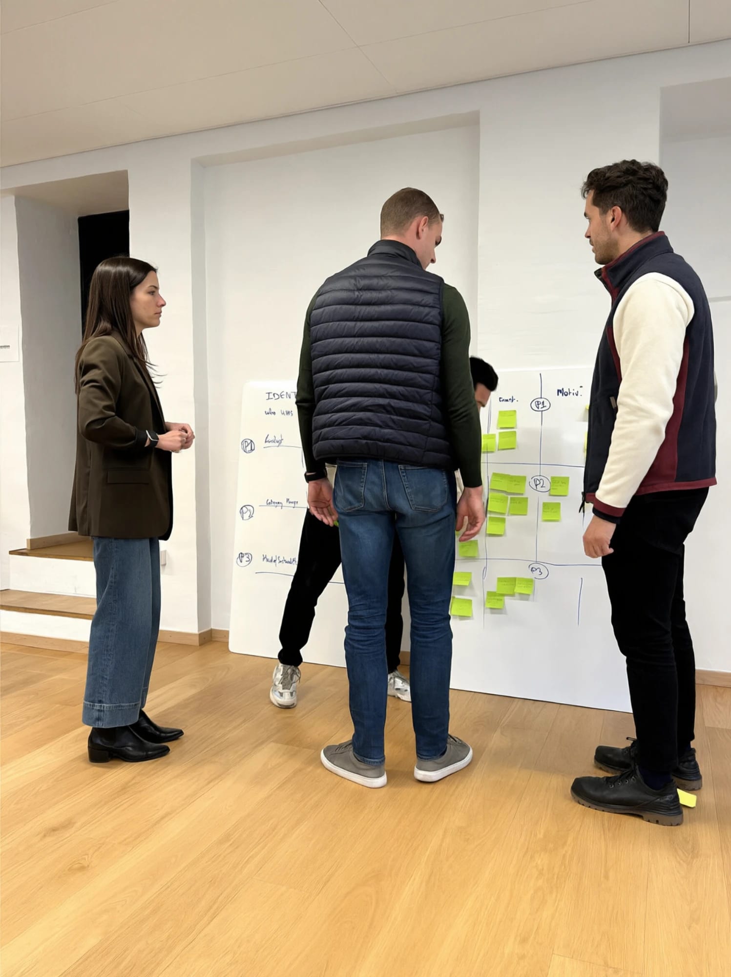
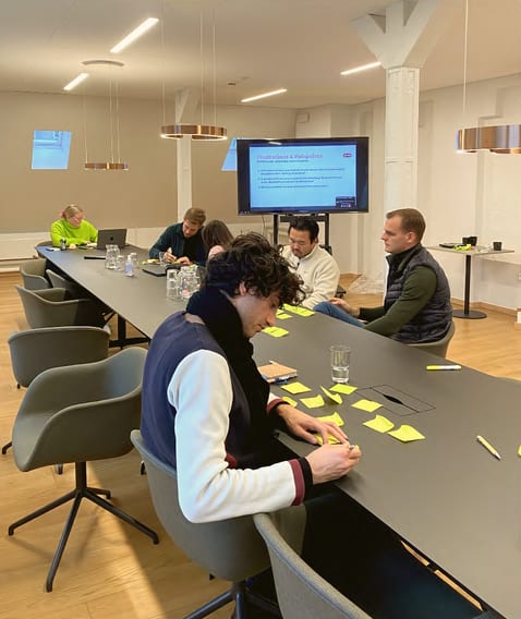
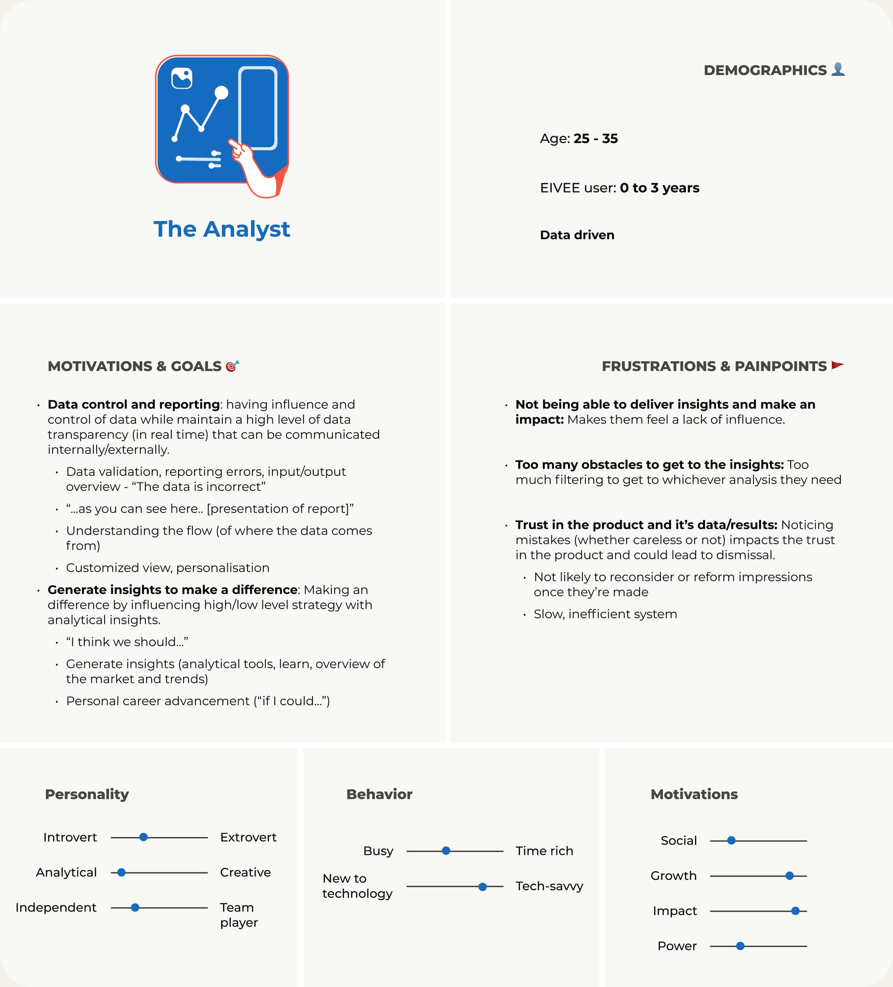
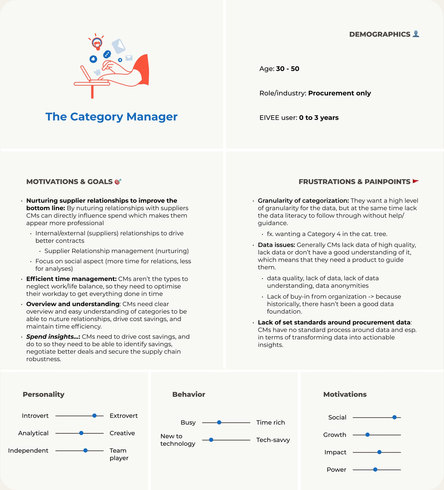
The result. Three proto-personas, co-created and agreed by the people closest to EIVEE’s customers: the Analyst, the Category Manager and the Head of Sustainability, each with demographics, motivations, frustrations and the slider profiles from the workshop. Documented in Linear and a findings deck, they became the base for the UX work that followed, starting with the MVP.
Working with the whole company
The workshop did more than produce personas. For two hours, colleagues from four departments and some of EIVEE’s top customers worked on the same wall, and what each knew, until then held in separate conversations, became one picture the whole company could point to. It also gave the UX team a reason to be in every product conversation that followed.
The MVP
The brief. Rebuild EIVEE’s dashboards as its own web product, starting with the sustainability module, for a December launch.
The groundwork. Audits of the Power BI application and of competitors, and data-visualisation exercises to choose the right chart for each data point.
The design. I mapped the MVP’s structure first: the global and local navigation, every view of the sustainability module from the executive summary down to emissions per supplier, category and business unit, and the open questions beside each one. Then low- and mid-fidelity wireframes and interactive prototypes in Figma, shared with the development team and iterated with the whole company’s feedback. Adjustments to the structure, the categorisation and the components shaped the first version of the product.
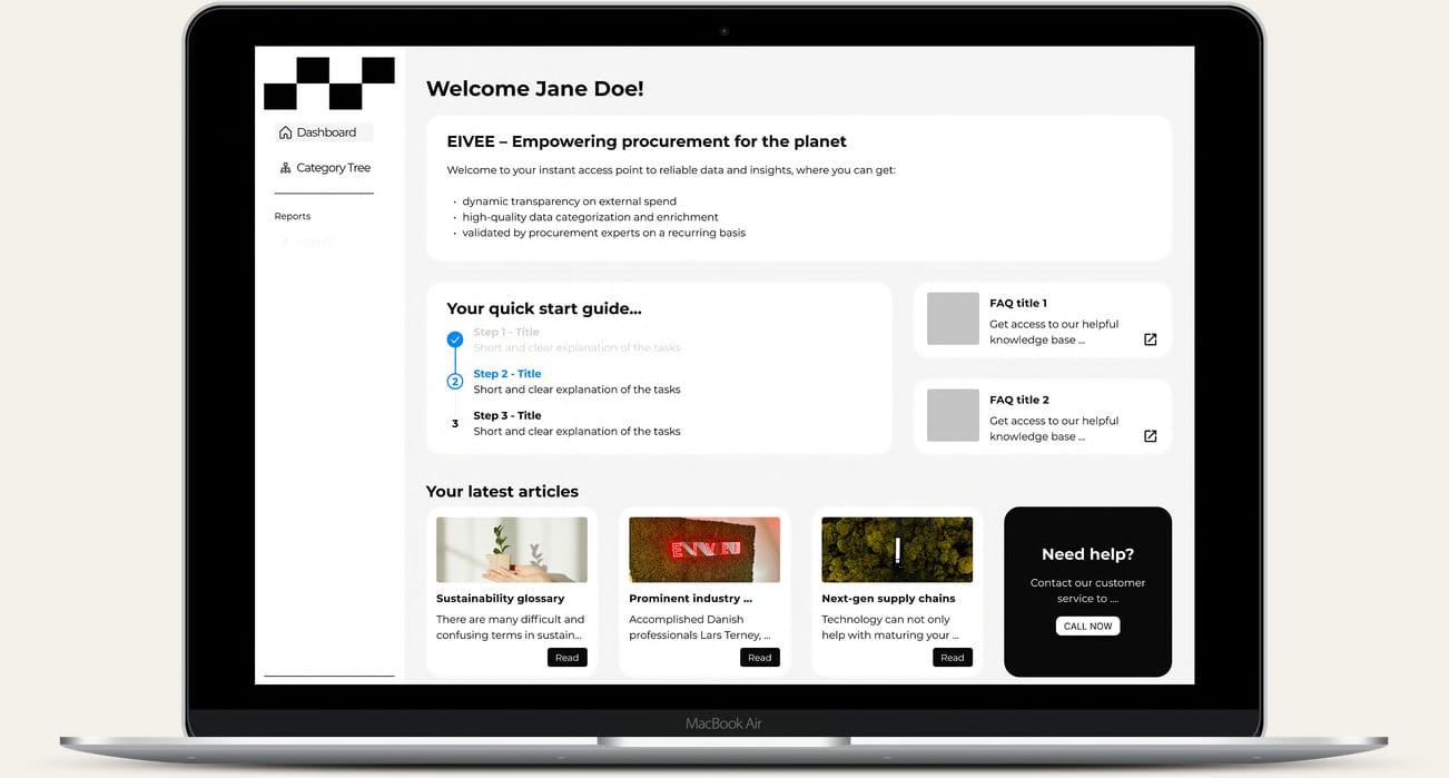
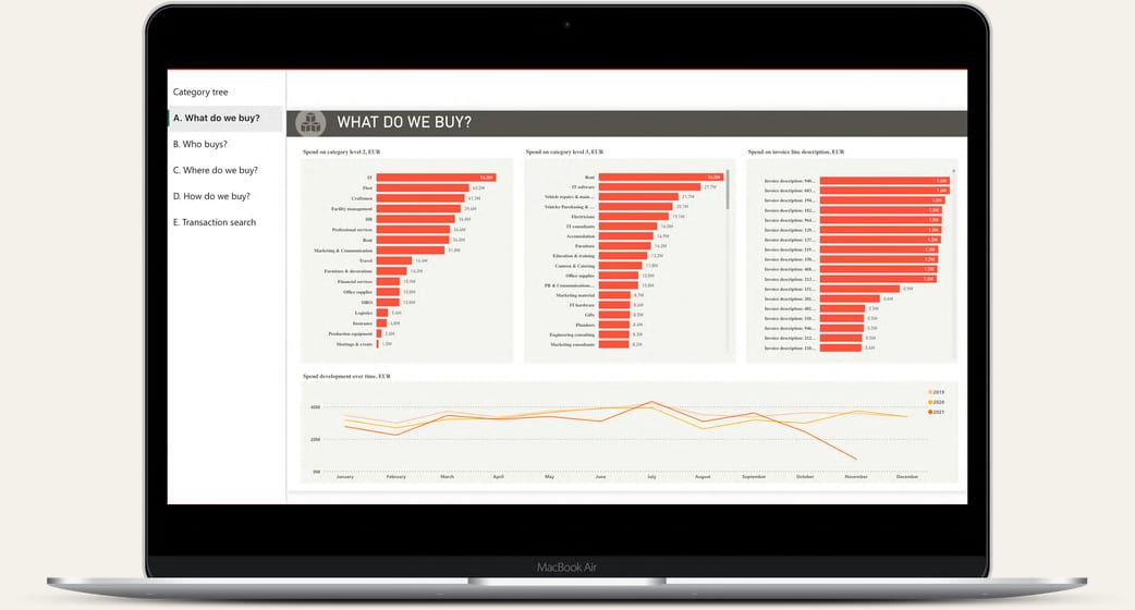
Before and after. The same question, “What do we buy?”, first as a Power BI report inside each customer’s own tool, then as a view in EIVEE’s own product, with the key figures first and the detail one click away.
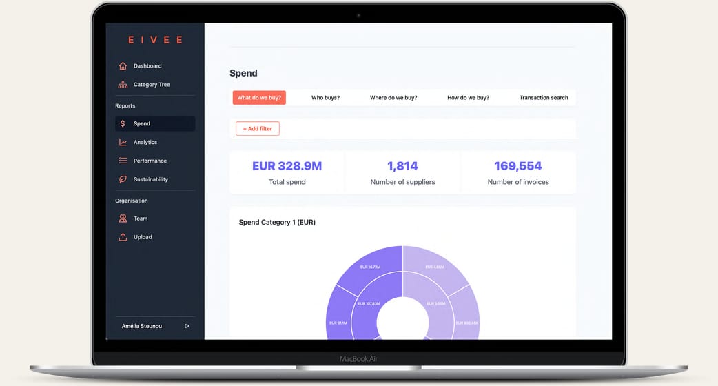
The result. The wireframes and prototypes were handed to development, and the MVP launched in December 2022. Six months later, positive testimonials from EIVEE’s clients had risen by 32%.
Handing over
I left EIVEE with the MVP launched, three proto-personas the company had built and agreed on, and the next steps written down: interviews with end users to turn the proto-personas into personas backed by data, and usability tests of the MVP, for which I left a first draft of the questions.
Takeaways
- The knowledge is often already in the building. The people who talk to customers every day, and the customers themselves, hold most of what a team needs to know.
- Co-creation builds ownership. The colleagues who shaped the personas recognised their own knowledge in them, which made them a shared reference rather than a deliverable from the UX team.
- The value of a workshop lies in its conversations. However carefully a session is planned, participants will take it somewhere new: at EIVEE, they built their own matrix of the company’s users while discussing them. Those unplanned exchanges are where an organisation surfaces what it knows about its users, and what it has yet to learn.
- Make the data playful. The slider profiles came at the end of two hours, when energy is lowest. Each participant set the sliders alone, on their own layer of the same iPad page, so no one could follow anyone else’s answer. Laid over each other, the layers showed at a glance where the company agreed about its users and where it didn’t: the clearest data of the day.